

Jim Davis Designs: Responsive website redesign for growth
The Project
The Brief: increase revenue by offering an easier user journey on desktop and mobile
For: Jim Davis Designs
My Role: Lead UX/UI designer
This commercial project was part of an end-to-end Digital Marketing strategy crafted to grow Jim Davis Designs’ clientele.
Jim Davis Designs’ business model thus far had been a hands-on approach with physical visits on-site, requests for quotes and product lists via direct email to the owner, with little digital presence or marketing.
The goal is to grow the business by implementing a marketing strategy to drive users and customers to the website for preliminery interaction with the company. It became clear early-on that we needed to build a digital presence for users to easily find the information they needed, and be inspired and reassured of the premium quality of service and products.
Tools: Figma, Adobe XD, Squarespace
Heuristic Review; Competitive Benchmarking; Personas; Flow Diagram; Wireframes; Interface
The challenge:
Jim Davis Designs is small family business in the window treatment sector. The company’s goal is to increase customer acquisition and overall revenue with currently minimal online presence. How can we grow the business by creating a digital presence offering a great user experience on par with the high quality of services they are known for?
The approach:
I started this project with a stakeholder interview to understand the landscape of Jim Davis Designs, company goals and target personas. This helped me map out the approach to take within the time and budget limitations.
The first piece of research I undertook was a heuristic review of the current website to sound check the state of affairs. Following this, I looked at the data behind the scenes (website traffic, keyword search, popular content, drop out rate etc.) to discern areas of improvement. Finally, the competitive benchmarking helped identify gaps and competitive landscape.
The outcome:
Through the research phase, I discovered that visualisation is extremely important and users want to be able to see what product and level of quality they will be getting. Whether users visit the website knowing what they are after or not, the categorisation of products helps the user navigate the offering more efficiently. And because the products are not everyday items, it is important to lead with visuals to convince and/or inspire “on-the-go”. Because mobile is the most used device, mobile optimisation is paramount as is implementing a clear and easy way for users to get in touch with the business.
The solution:
By creating a flow diagram to understand where each screen would sit in the structure, I was then able to share wireframes with the client to show the main focus points of the new website: visualisation of products and projects are at the center of the website story. The categories of products supported by visual clues help the users navigate through infrequent product names and reduce the drop out rate. Finally, introducing clear CTAs and improved Contact Form streamlines the experience for both the user and the Business.
The Research
I started with an interview of Jim Davis Designs’ CEO to undertand the goals, competitive landscape and target market.
Following, I took a look at the state of affairs with a heuristic review of the current website and digital presence, supported by data gathered from website traffic, keyword search, social traction etc., to to understand areas of improvement and areas of success.
Finally, I lookedat the competition for similar sized companies as well as big players to acclimate myself with the industry and products. This also helped me understand the differentiors to put at the forefront of the site to discern the JDD brand from others.
Stakeholder interview
Jim Davis Designs is a family business with a great reputation and a list of loyal clients. The main goal for the Business was to increase their client list with new prospects and customers with the overarching goal of increasing their revenue. Focusing on luxury items, the look and feel of the website needed to reflect the quality JDD is known for.
What can be improved?
Drop out rate: 42% of users dropped out after hitting the landing page, due to a “Enter” button
Keyword search: lack of categorisation makes keyword search difficult
Product categorisation: lack of clear categories/use of broad general categories
Industry jargon: products’ descriptions not representative of everyday users
Mobile optimisation: 88% of users access the website via mobile, however mobile is not optimised
What is currently working that we can leverage?
Visuals: Instagram where visuals are at the forefront is the main tool for traffic
Jim Davis: the CEO is the recognisable face and name being the business, his name is the top keyword for search
Get in touch: phone number is the main means for users to get in touch and is used often
Heuristic and Data review
Competitive benchmarking
Competitive benchmarking was used to understand the competitive landscape but also learn the industry standards and grasp the gaps to close when building the new website.
Product categorisation is a must and needs to be aligned with the majority of the competition. Customer reviews are also are the forefront of the strategy in this highly competitive landscape.


Personas
Defining personas helped build different user journeys and inherently help tailor the Marketing communications we’ll then put in place.
It was important to differentiate the B2C element from the B2B and keep both in mind when designing the interactions.
Key findings:
New users are looking for visuals and inspiration
Jimdavisdesigns.com had very low traffic due to the word-of-mouth nature of their Marketing so far. Their social pages were however a good source of traffic, which uncovered that visualisation and inspiration were an area to focus on to drive users to the new website.
Users are not experts
The lack of categorisation of products and naming conventions made the website feel like it was for industry people/experts.
A clear and actionable call-to-action helps streamline the incoming business
A “call us” CTA was in place, which was not sustainable for future growth. The implementation of a clear form and email mechanism helped streamline incoming requests and communicated to users that their request will be answered shortly.
Mobile is the primary device used to access the website
It was imperative that we take a mobile first approach, as the vast majority of the traffic happens on mobile.
Users rely on reviews to make their decisions
The Solution
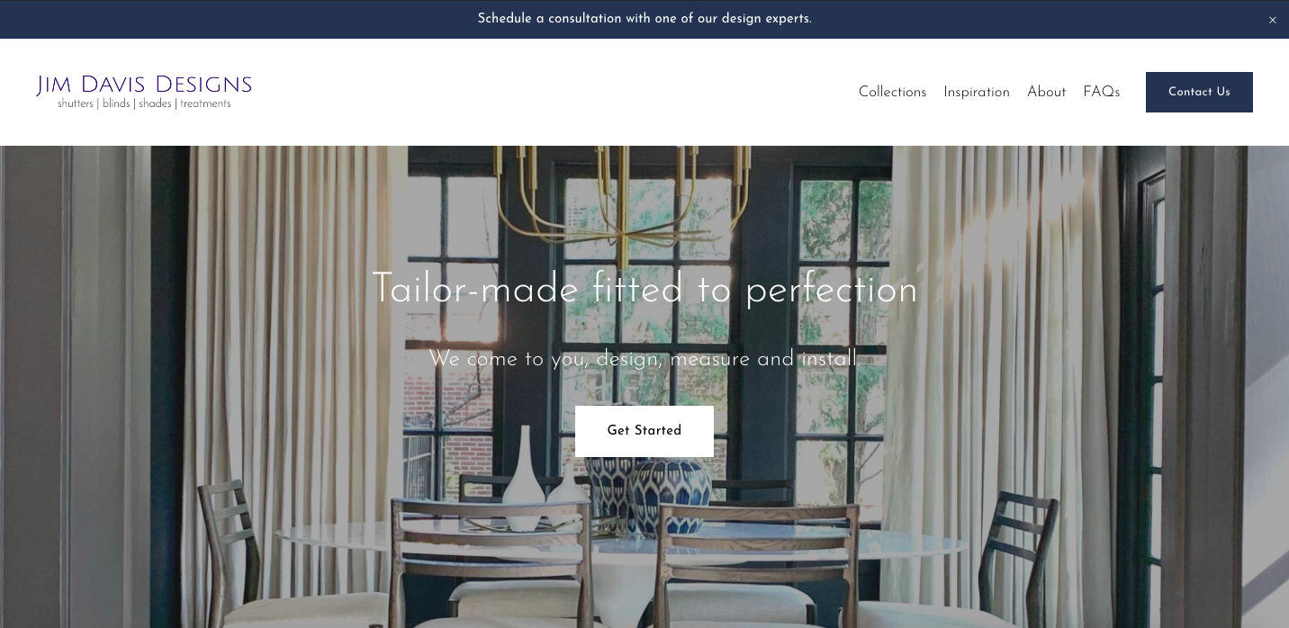
The Landing Page
I introduced a non-intrusive banner with a clear CTA to book a consultation with the expert team of JDD.
The menu is divided in simple categories, addressing both users that are decided or undecided.
The “Get Started” button drives to the inspiration page, making the visual aspect a key element for the user journey, especially for the undecided.


Dropdown menus
Introducing dropdown menus to categorise content is designed to help the users find what they are looking for on a simple hover. The imagery adds simplicity and showcases the quality of goods they can expect from Jim Davis Designs.


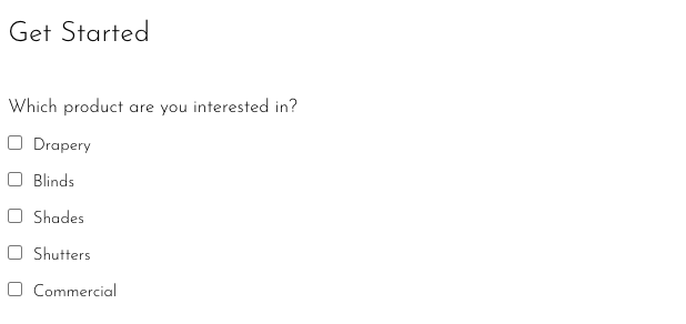
Simplified form
Finally, I introduced a form to simplify the interaction between users and business.
The form includes the option for the users to select which product they have an interest in, while allowing Jim Davis Designs to account for scheduling, ordering and work involved.
The postal code field also has a dual purpose: informing the users that the company operates in one region, and helping Jim Davis Designs schedule consultations and installations.
An automated reply is sent to each enquiry, letting the users know that their query will be answered shortly.


Final thoughts and learnings
This commercial project allowed me to revamp an existing product by actioning a user-centric thought process while meeting the business’ needs in terms of both budget and time. It was also extremely valuable to immerse myself in the UI aspect of the project and deliver a final product that really is defined by elevated visualisations.
If budget allowed, I would like to be able to do more Usability Tests before and after to gather more crucial user feedback. The outcome of the above is the 1st phase, so watch this space!* *This project is ongoing. :)