

Richer Sounds: UX Audit and recommendations to improve the purchase journey to increase online sales
As an Ex-Amazonian, I am well-familiar with the e-commerce landscape and am always looking for ways to support other companies improve their purchasing journey by designing great user experience on their website across desktop and mobile.
This output was a sprint reasearch project for an e-commerce specialised UX agency. The deliverable was focused on the product page, showcasing the improvements recommended.
The Project
The Brief: Perform an UX audit and design an improved purchasing journey to increase online sales
For: Richer Sounds
My Role: Lead UX Designer
Tools: Figma
Heuristic Review; Competitive Benchmarking; Medium-fidelity Prototyping; Wireframes
The challenge:
Richer Sounds is a British home entertainment dicount retailer that operates through a chain of 52 stores and online platforms, mainly in England. In the era of Amazon as the e-commerce leader, how do we improve the purchase experience to increase their competitiveness and drive online sales as a means to grow their revenue? Focusing on the Product page, create a new design based on your recommendations.
The approach:
Due to the time limitations of this task and available resources, I started this project by a UX audit of the current website combined with a competitive benchmarking to gain better understanding of the improvements I could make to the purchase journey so Richer Sounds could drive more online revenue with an improved purchase process.
The outcome:
The main takeaway from the research phase was the lack of clarity of the overall website. A busy interface, a lack of clear product categorisation and product information, and a lengthy transaction phase showed room for enhancement for a better user journey but also room for upselling opportunities.
The solution:
By sketching out a first iteration of a product page for both desktop and mobile, I was able to design and wireframe a simpler and clearer screen where products and CTAs are at the forefront of the experience, while the Unique Selling Point of Richer Sounds is evidently more visible throughout.
The Research
I started this research project with UX audit of the Richer Sounds website to uncover areas of improvement.
The Amazon-era has made e-commerce extremely competititive and Amazon has dictated the conventions to follow in the industry. I followed the audit with a competitive benchmarking with 4 competitors (Amazon, Currys, Argos and Sevenoaks) to highlight any gaps.
Heuristic review; Competitive Benchmarking
Heuristic Review and Audit
Focusing on the end-to-end purchase process, I highlighted areas of improvement for each step and offered actionable solutions to enhance the user journey.


The Solution
After reviews of competitors and UX audit, I came up with a design for the product page for both desktop and mobile. The goal here is to improve the clarity, information accessibiity and ease of use of the platform.
Offering a quick view of relevant information was paramount to increase the user satisfaction.
By introducing visuals, extra services options and product information at first glance on the product page, we allow the users to feel confident in pursuing their research with all information at hand.
The addition of accessories related to the product being viewed and the clear discounts, allow the users to add items and see the total price without having to go back and search from scratch. Commercially, it is a great upselling opportunity for Richer Sounds.
The next section is the option to “book an appointment”. This feature differentiates Richer Sounds from the competition and so needs to be more visible to users. Ideally, this button would drive user to a calendar with available times and dates for a consultation.
The section “also viewed” gives the users the opportunity to clearly browse other product information and deals.
Then, detailed information is provided for users to look deeper into the product specifications and technical details. By default, the reviews would appear first. The core product information being made available at the top, reviews are next to help users make a decision.
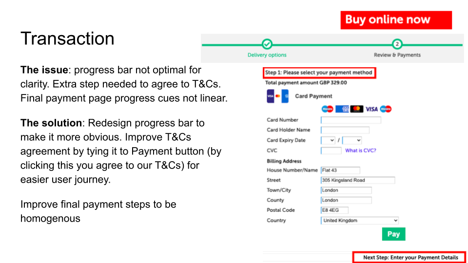
Finally, the checkout is optimised for online sales. The transaction process is made cleaner with a clear call to action to add to basket.
The addition of accessories and extra services directly at checkout allows users to add more items to cart easily, saving time. And it is again commercially an opportunity for the business.
A click and collect option is introduced with a postcode input that drives user to nearest store automatically, removing the need for a lengthy research process of their local store.
Final thoughts and learnings
This sprint was an excellent exercise dealing with time constraint. It taught me to work quickly with having the best user journey in mind tied with the company’s goals.
Ideally, I would have gone through various other UX research to gather more data, have direct user feedback and a better overall overview of the purchase journey. I would have gone through: Stakeholder Interview with to understand business goals and pain points; Analysis of website traffic; Usability test; Card sorting; User flow.